// CLIENT
FMKR: A RECORD LABEL SITE THAT READS AS A COMPANY
Logo, brand values and website for Fat Man Kills Records, designed around who visits it, then rebuilt around a hand-drawn hero and a walking mascot.
- CLIENT
- Fat Man Kills Records
- ROLE
- Logo & brand values, Art direction, Web design, Motion design, Front-end development
- DURATION
- Built July 2026, homepage redesigned October 2026
- YEAR
- 2026
Fat Man Kills Records is an independent music company in Mumbai, run by FMKRP LLP. I designed the logo and brand values, built the site, and in October rebuilt the homepage because the first version, though sound, looked like every other label site.
1. The problem
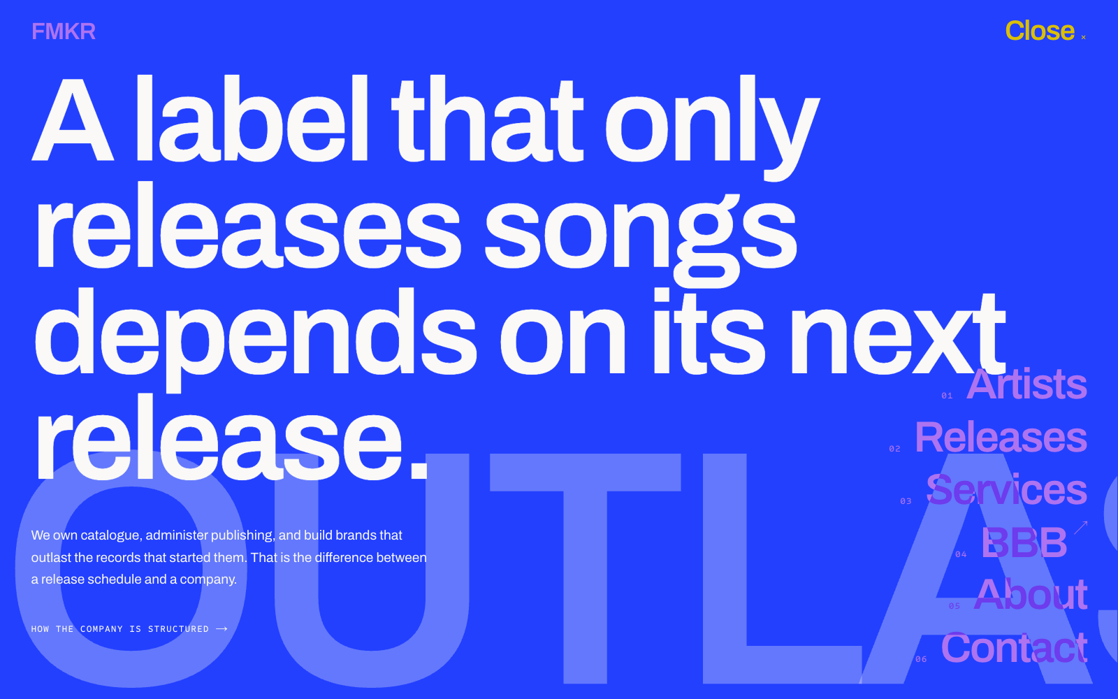
Most label sites are a roster and a list of releases. FMKR describes itself as something else: not a label that releases songs, but a company that owns catalogue and builds brands. The site had to say "company" early without becoming a corporate brochure.
2. Structure it around who visits
Three kinds of people turn up, and each arrives with a question. Artists ask whether FMKR is worth sending music to. Partners ask what it can do for them. Licensors ask who to talk to about rights. So the navigation answers those questions (Artists, Releases, Services, About, Contact) instead of mirroring the label's org chart. Services sits next to the music rather than in a footer, because a partner shouldn't have to hunt for it.
Contact routes enquiries to separate desks, so a demo reaches A&R and a licensing request reaches rights. Both senders get a reply from the right person.
3. Direction for the redesign
My first redesign passes were generic: a floating 3D object, a glowing orb, text over a gradient. I set rules instead, each with a reason:
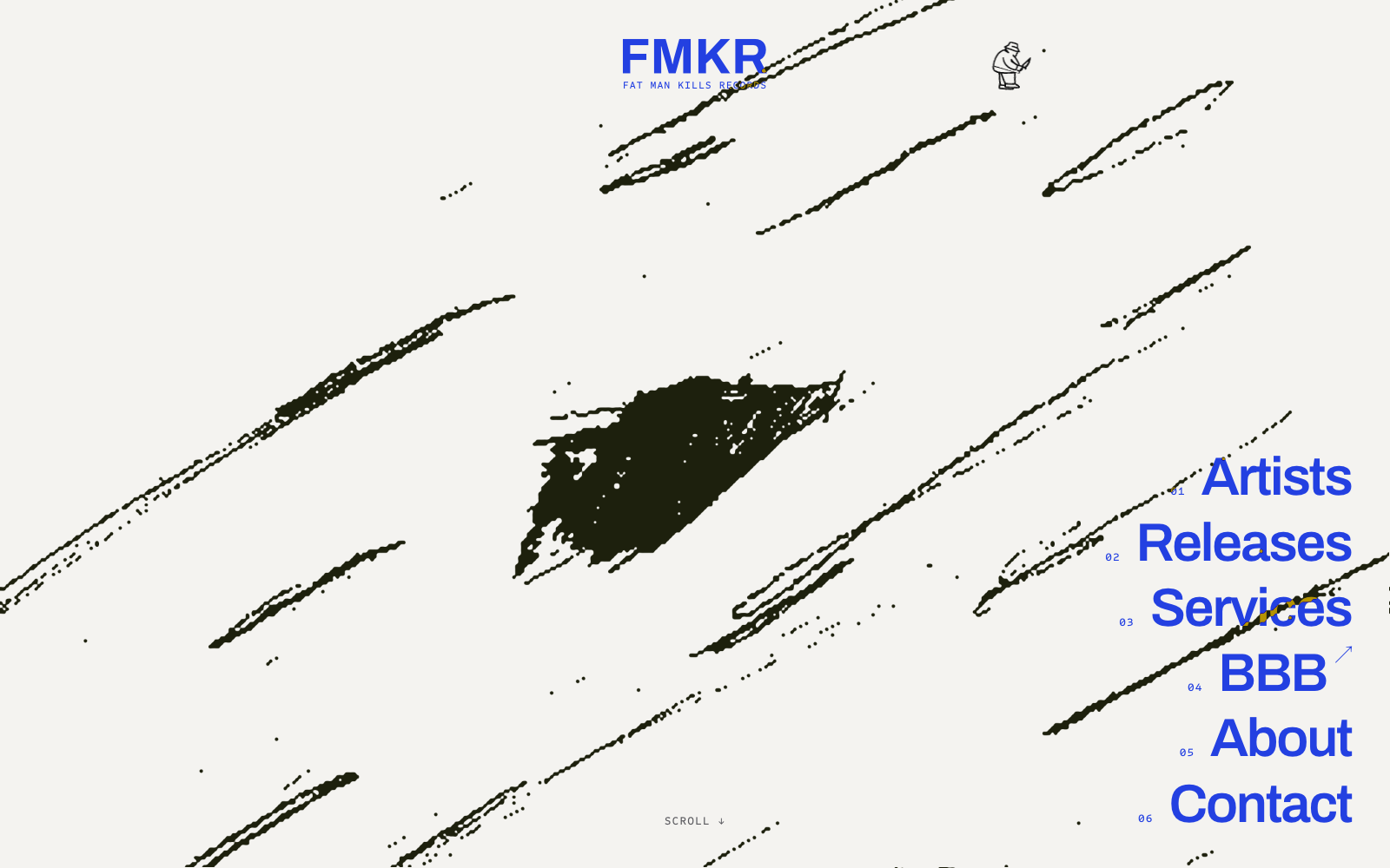
- One hero object. A single focal point means a first-time visitor knows where to look. I tried a 3D mask, the logo and a vinyl record, and kept the one thing that looked made by a person: a knife animation I drew frame by frame.
- A few huge elements, the rest small. An uncrowded hero reads in a second.
- No header bar. A strip across the top reads as a separate section, so the links live in the page itself.
4. Navigation that gets out of the way
On the landing page the links are a large stack in the corner, so you don't need a menu to find them. When they scroll out of view, a Menu button appears so navigation is always one click away, never two controls at once. It reopens the same stack over wherever you are with no panel behind it, so you keep your place. The links change colour against the page (blue on paper, gold over dark) so they stay readable on every section.
5. A mascot, drawn to walk
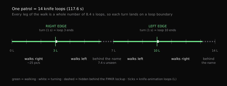
The logo's mascot walks the top of the hero, passing behind the FMKR lockup. The logo's own legs hang from two different hips, so the back foot only ever dragged. I kept the drawn head and coat and drew new legs in the same outline, both from one hip, scissoring past each other. It's all SVG and CSS.

I also timed the walk to the knife animation: each crossing is three of its 8.4-second loops, so he reaches the screen edge and turns exactly as a loop ends. The page can't read an animated image's clock, so a small component starts both together and re-aligns them after scrolling away. I checked it frame by frame and measured a 0 ms offset.
6. A billboard for the newest release
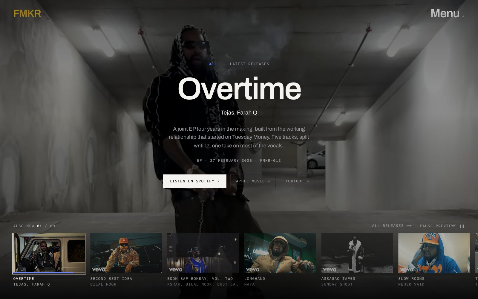
The latest releases fill the screen: a muted preview, the details in the middle, the rest lined up to skip to. The listen links are right there because a visitor who came to hear something shouldn't have to dig. Auto-advance has a visible pause control. Video only loads when the section is on screen, and on phones, with data-saver or with reduced motion it falls back to still images.
7. Problems found by running it
- Smoothing the knife frames with an SVG filter quietly deleted the fine lines I'd drawn, so I re-rendered the animation once at 2400 px instead.
- A statement band was rendering white on white, a blank screen on the live site, because a style read the accent colour after redefining it. I fixed it with a separate token.
- The header flashed its old layout on refresh. The first paint is now the final layout.
Result
Live at fmkrecords.com. Lighthouse on the redesigned homepage: 91 performance, 96 accessibility, 100 best practices, 100 SEO, with a 0.8 s largest paint and no layout shift. The hero's weight costs Speed Index (3.6 s), and the one accessibility flag is a deliberately faint decorative word.
The structure and engineering are real. The roster, releases, artist portraits and billboard footage are placeholders for now, and I've tested in Chrome only. Built with AI tools; I review, test and own everything that ships.